
Choosing James Hardie Colours in BC: ColorPlus, Fade and What Looks Right Here
How to choose James Hardie ColorPlus colours for a Lower Mainland home: what fades, what hides algae, how coastal light changes colour, and combinations that work in BC.
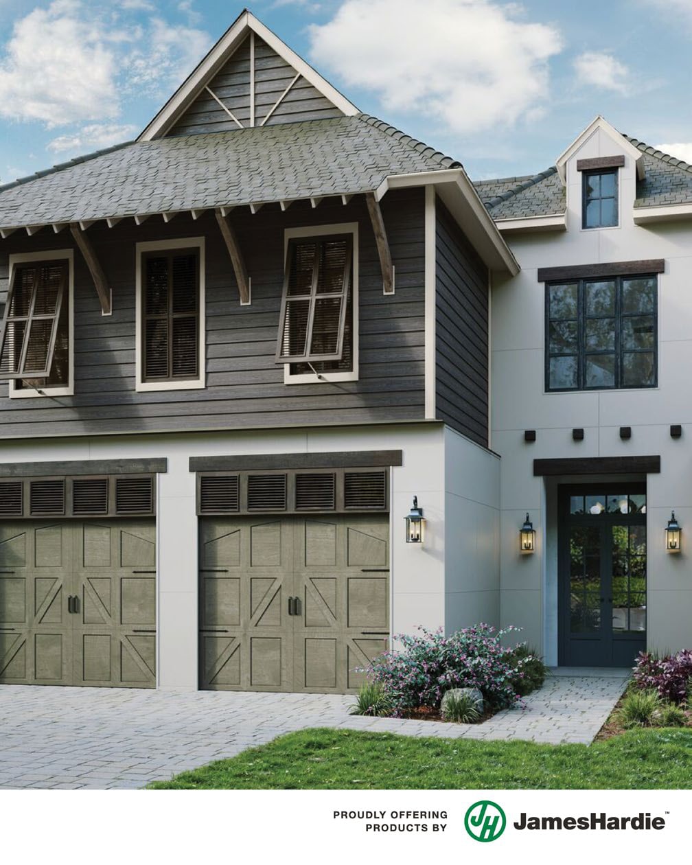
Colour is the decision homeowners lose the most sleep over, and the one where BC's particular light and weather change the answer. A swatch that glows in a showroom reads completely differently under our ten months of overcast, and a colour that behaves in Kamloops sun grows a green film on a shaded Burnaby north wall by year three. This guide is how we walk clients through Hardie colour selection, part of our siding guide for BC buildings.
Why ColorPlus is the starting point
James Hardie's ColorPlus finish is applied in the factory, multiple coats baked onto the board in controlled conditions, and it is the reason a Hardie colour decision is a decades-long commitment rather than a repaint-cycle one. Compared to site-painted board, factory finish resists UV fade dramatically better, resists the coast's constant damp without the adhesion problems site paint can develop, and carries James Hardie's own finish warranty on top of the substrate warranty.
Site painting still has a place, a specific heritage colour, a strata matching an existing scheme, but the default for a Lower Mainland home is ColorPlus, and the palette is wide enough now, especially with the Dream Collection extension, that "they do not have my colour" is rare. The premium over primed-and-painted board is modest up front and usually negative over ten years once the first repaint you never needed is counted, math we break down in our Hardie cost factors guide.
How BC light changes colour
The Lower Mainland's light is soft, grey and blue-shifted for most of the year. Under it, colours behave in ways swatches do not warn you about.
Greys go blue. A neutral showroom grey often reads distinctly blue under overcast sky. If you want a true grey on the wall, lean warm on the swatch, toward greige.
Whites go flat. Brilliant whites lose their sparkle without sun and can read clinical against wet dark roofs and evergreens. Softened whites, cream, oat, mushroom-tinged whites, keep their warmth in the gloom.
Dark colours gain drama. Deep charcoals, iron greys and blue-blacks look extraordinary against coastal cedar and fir backdrops, which is why the dark-body look took over the North Shore. They also show chalk, pollen and touch-ups more, and they absorb heat on exposed elevations.
Muted colours belong. The colours that consistently look right here are the ones already in the landscape: fog greys, moss and lichen greens, driftwood taupes, wet-sand beiges, forest-shadow charcoals. Saturated primaries fight the setting; muted complex colours join it.
The test that never fails: get large samples, two boards if possible, and look at them on the actual wall on a grey day, a sunny evening, and while wet. Move them between elevations, because the same board reads two shades apart on the bright south face and the shaded north one. Photograph the samples with your phone in each condition and look at the photos on a different day, distance from the moment is a surprisingly good editor. Every serious colour regret we have seen came from deciding indoors, at night, from a two-inch chip.
Fade, elevation by elevation
Fade in our climate is not uniform, it is directional. South and west elevations take the UV; north elevations take the algae; east walls coast. That asymmetry matters twice. First, in colour choice: a very dark or highly saturated body colour will drift visibly on the south wall while the north wall holds, and in ten years the house wears two versions of its colour. Mid-tones drift too, but the drift is far less visible. Second, in repair planning: future repairs match faded walls better when the starting colour had less distance to fall, something our vinyl repair guide shows in its most painful form and fiber cement mostly avoids.
ColorPlus moves the whole problem years down the road, its fade curve is long and gentle, but physics is physics, and on wide-open exposures, we say so before you commit to espresso-dark walls.
Colour and the green film
Every experienced coastal painter and sider knows the real enemy of light colours here is not fade, it is biology. Shaded, damp elevations, north walls, walls under trees, walls in the mountain shadow of North Vancouver and Maple Ridge, grow a green algae film that shows on white and pale walls within a couple of seasons and disappears visually on mid-tone greys and greens.
The film wipes off with gentle washing and does not harm fiber cement, this is cosmetic, not decay, but if annual washing is not the relationship you want with your house, choose the wall's colour for the wall's exposure: crisp and light on the bright open elevations, mid-tone on the shaded ones, or one mid-tone everywhere.
Combinations that work here
The coastal classic. Mid grey or greige body, soft white trim, natural wood accent at the door or gable soffit. Works on almost every housing form from a Coquitlam special to a craftsman.
The North Shore modern. Charcoal or iron body, minimal matching trim, warm wood (real or woodgrain Longboard) at entries and soffits. Sharp against evergreens, forgiving of rain streaking.
The heritage move. Muted historical body, moss, slate blue, deep cream, with lighter trim and a saturated door. Character homes in New Westminster and East Van carry these beautifully, and HardieShingle gables complete the period look.
The two-material split. Lap siding body with shingle or board-and-batten gables in a second tone, one step lighter or darker rather than a contrast. Adds depth without the "paint by numbers" effect of high-contrast schemes.
For multi-family and strata projects the calculus shifts toward maintainability: fewer colours, mid-tones that hide weathering between maintenance cycles, and documented colour records so future phases and repairs match. It is a different conversation than a single home, and one we have often in our strata and restoration work.
Colour rules that save regret
Choose the roof first mentally: your roof is a fixed colour for decades and the siding must live with it. Cool grey roofs free you; brown and warm roofs push the body palette warm. Consider your neighbours, not to match them, but a street of greys makes a navy house a landmark and a lime one a cautionary tale. Respect the form: busy rooflines and many materials want calm colour; simple boxes can carry drama. And decide accents last, doors repaint in an afternoon, walls do not.
One more that is specific to us: think about the trim package early, because trim colour and trim quantity are intertwined with cost and with the profile choice between Plank and Panel. A high-contrast scheme demands more trim precision; a monochrome scheme hides it.
Four BC house styles, four schemes that work
Abstract advice lands better with worked examples. These are schemes we have put on real Lower Mainland walls, adjusted to protect the innocent.
The 1970s Coquitlam split-level. Body in a driftwood greige, soft white trim kept minimal, front door in blackened green, and the broad gable in the same body colour rather than a contrast, split-levels have busy enough rooflines without colour blocking. The greige hides winter grime on the carport elevation that white would broadcast.
The East Vancouver character house. HardiePlank body in deep slate blue, generous white trim doing the heritage work, HardieShingle gable in weathered grey-green, saturated ochre door. High trim contrast suits the era, and the complex body colour reads differently morning and evening, which old houses deserve.
The North Shore contemporary. Iron grey body, trim matched to body for a seamless mass, cedar-tone woodgrain at the entry and soffits. Against a North Vancouver treeline the dark mass recedes and the wood glows. The south face got a half-step lighter grey than the shaded faces, planned fade equalization, nobody has ever noticed, which is the point.
The Fraser Valley farmhouse. Board-and-batten HardiePanel in warm white, charcoal window surrounds, mid-brown wood porch details. Open-field exposure means real UV, so the white is a softened one with enough pigment complexity to age gracefully rather than go grey.
Steal any of these outright, colour schemes are not intellectual property, or bring them to the sample stage as starting points.
When someone else gets a vote
Not every colour decision is yours alone, and finding that out after ordering is the expensive version.
Stratas and townhome complexes almost always control exterior colour through bylaws, and a re-side or repair must match the approved scheme or go through council for a change. If you sit on a council contemplating a complex-wide recolour, the working rules: fewer colours than you think, mid-tones for maintenance grace, and a documented specification, product line, colour names, codes, filed with the strata records so phase two and every future repair can match phase one. We handle that documentation as part of our strata and restoration work, because a colour nobody wrote down becomes a matching mystery within a decade.
Heritage designations and character-home programs in Vancouver and New Westminster can bring colour guidance or approval steps for designated properties, often anchored to period palettes. This is rarely the obstacle owners fear, the approved historical ranges are full of deep, handsome colours, but the sequence matters: confirm before ordering, since factory-finished board is made to order. Municipal heritage staff, reachable through vancouver.ca for Vancouver properties, will tell you quickly whether your address carries any colour strings.
Building schemes and design guidelines in newer subdivisions, common across Surrey, Langley and the valley, sometimes encode approved exterior palettes in the title documents. Five minutes with your purchase paperwork beats a stop-work letter mid-project.
None of these constraints produces a worse-looking house. Some of the best schemes we have installed were forced into discipline by an approval process, then chosen well within it.
Colour and resale, briefly
If selling within five years is plausible, the calculus tilts conservative. Listing photographs flatten colour subtlety: complex mid-tones photograph as reliable good taste, while bold choices photograph as a project the buyer inherits. Realtors in this market consistently push exteriors toward the grey-greige-white family for a reason, and fighting that consensus costs real dollars at offer time. The door and accents are where personality can live rent-free, they read as charm in photos and repaint in an afternoon for the next owner. If you are staying past ten years, ignore this section entirely and paint the house you want to come home to.
Living with the colour: touch-ups and upkeep
ColorPlus ships with a practical afterlife. Boards get cut on site, and cut edges and the occasional scratch are handled with the matched touch-up kit, keep it, label it, store it indoors, future-you will hunt for it. Annual washing is a hose and soft brush, no pressure washing, which strips finish and voids goodwill everywhere. When repairs happen years later, ColorPlus's slow fade means replacement boards land close, far closer than the vinyl matching lottery described in our vinyl repair guide, and the remaining gap gets managed the way pros do it: repair boards on the least-lit elevation, harvested originals on the showpiece wall. Keep a written record of your colour names and order codes with your house documents; fifteen years from now that index card is worth an afternoon of detective work.
Where the decision actually gets made
Our colour process is unglamorous and it works: large physical samples on your actual walls, viewed on a grey day and a bright one, shortlist of two or three schemes, then a drive past local homes wearing them, we keep a mental map of Lower Mainland streets for exactly this. The wrong way is a phone screen at midnight.
And if you are truly stuck between two finalists, here is the tiebreaker that has never failed a client yet: choose the one that looks better wet. Your house spends five months of the year rained on, and colours that need sunshine to work spend those months sulking. The Lower Mainland's best exteriors are chosen for November and enjoyed all year.
If you are re-siding and the colour question is the thing holding you back, book a free assessment or call 778-358-2885, we bring the sample boards, and the street list, with us.